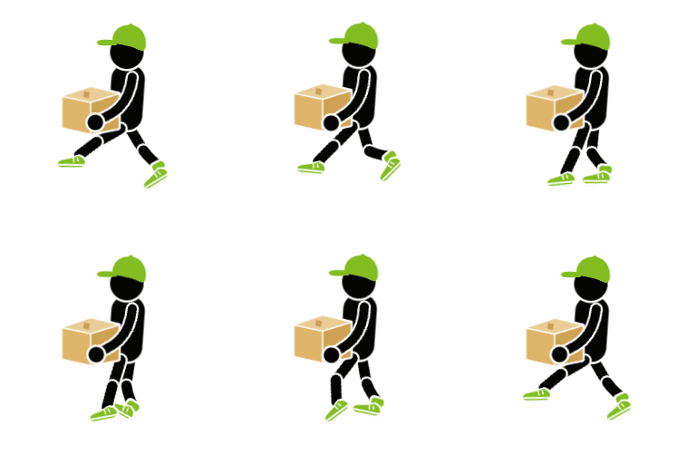
Live — walk loop → completion
The loader finishes its current stride before playing the completion, so the hand-off never jumps.
Sizes
One vector asset, crisp at any size. Status messages appear automatically when an operation runs past ~2 seconds.
Dark mode
The white contour keeps the silhouette readable on dark surfaces — no separate asset needed.
Lottie version
loader.json — 25 KB, markers loop (0–57) and done (57–78). Drive the completion with playSegments.
Assets
| File | Use | Size |
|---|---|---|
| loader.json | Lottie — primary animation asset (lottie-web / dotLottie players) | 25 KB |
| loader.lottie | dotLottie bundle | 2.4 KB |
| loader.svg | Self-animating SVG — zero dependencies, use as <img> or inline | 10 KB |
| safebox-loader.js | Web component <safebox-loader> (this page uses it) | 16 KB |
| SafeBoxLoader.tsx | React component for the Lovable customer app | 15 KB |
| loader.webp | Animated WebP fallback (email, no-JS) | 164 KB |
| loader.gif | GIF fallback (last resort — binary alpha) | 148 KB |
| loader.png | Static poster (reduced-motion / print) | 28 KB |
Integration
Framework-free page:
<script src="safebox-loader.js"></script>
<safebox-loader size="96"></safebox-loader>
<!-- when the request resolves: -->
<script>loaderEl.setAttribute('state','done');
loaderEl.addEventListener('done', () => overlay.remove());</script>
React (Lovable):
import SafeBoxLoader from "@/components/SafeBoxLoader";

{isLoading
  ? <SafeBoxLoader size={120} />
  : <Content />}
// or play the completion before revealing:
<SafeBoxLoader state={isLoading ? "loading" : "done"}
  onDone={() => setShowContent(true)} />
Accessibility & performance: tab hidden → animation pauses;
prefers-reduced-motion → static mascot with a soft opacity pulse;
pure CSS/SVG transforms — no layout shift, no JS on the hot path.